From the original article, "Present Your Portfolio Like a Pro" by Elizabeth O. Dulemba.
 It seems simple once you know how it’s done, but at some point you do have to actually learn how to correctly prepare and show an illustration portfolio. Despite being used for such different purposes as interviews, presentations, or shows, there are some basic rules most professionals follow.
First, size matters. Most portfolio shows have limitations of about 17” x 22” (closed). Keep to that size or smaller and you’ll be able to travel easily with your portfolio and use it anywhere. Big portfolios may seem impressive, and were all the rage when I graduated from college, but after several interviews where the only surface large enough to hold my portfolio was the floor (with me in a skirt), I rethought my approach.
In determining size, think of how you reproduce your art. Consider cost and speed. My portfolio holds 8 1/2” x 11" sleeves. I can print out my pieces straight from my home printer as quickly as I change my mind. It makes my presentation highly flexible, that’s important.
Portfolios come in a vast array of quality levels and styles. The case should be something you can afford, but do splurge a bit. A nice portfolio can reflect how seriously an artist takes him or herself. Conversely, a cheap or messy portfolio sends a message as well.
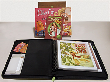
You want one that will close completely to protect your work while in transit and comfortably lay flat when open, preferably with a matt black interior. Beyond that, if you want fancy handles, pockets, elastic bands, etc, it’s a matter of personal taste. I prefer pockets to hold take-aways* and reply cards.
Choose a portfolio with a central binder and removable sleeves. That way you can easily rearrange and streamline your presentation without any leftover pages. It’s also nice to replace the sleeves as they get damaged over time. (Trust me, they will.)
Include ten to fifteen copies of your best work. You can have these done at a copy center or print them to a heavy gloss paper on your home printer. Never include original artwork, it may get lost or damaged. More importantly, show your work as it’s destined to be seen in its final form, printed.
Make sure all your work presents a cohesive style so a buyer can get a good idea of what they’d receive if they hired you. Keep your content relevant to who will be viewing your portfolio, no nude figure drawing sketches for the children’s market! (Don’t laugh, I’ve seen it.) Start with your strongest piece and end with your second strongest piece, Wow! to Kapow!
Another school of thought is to show your best pieces at the front, as sometimes Art Directors won't make it all the way through your portfolio.
If you have several different styles, don’t mix them all together in one portfolio, it’s too confusing to a buyer. They need to be able to tell what they'll get if they hire you. Either present various styles in clearly marked sections, or show them in separate portfolios. Customize your presentation to your viewer.
Only show work you love to do, or you may be stuck creating a style you hate. You may do fantastic still lifes or logos, but you’re not trying to show everything you can do, you’re trying to establish a “look” that will be associated with only you, a brand. Pick a style you can happily run with for a while. You’re work is more likely to stay in a viewer’s memory that way.
Include your name and contact information on every piece in your portfolio; however, don’t include a date. (You are so brilliant you created everything yesterday.)
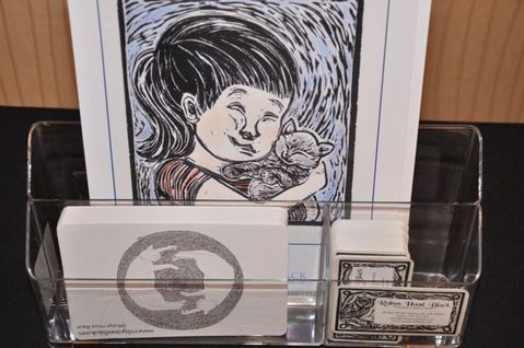
Have postcards or bookmarks made to include as take-aways. Make sure they have your contact information and web site address clearly visible. (You do have an online portfolio, right?)
If you have any published books, display them on a small bookstand above your portfolio. If that’s not permitted, or you’re worried about your books becoming separated, loop a string or ribbon around the spine of your book and attach the other end to your portfolio. You can do this with ONE work-in-progress dummy as well.
Feel free to jazz up your portfolio to show some personality, but keep in mind, the main thing is to keep it simple and clean so that your artwork can truly shine.
P.S. A note on electronic portfolios... I've seen iPads left out for portfolio viewing and I must discourage this. Not only does it present a danger of theft, but technology fails, and can be hard to view by more than one person. They also often require the artist to be there to show the viewer how to navigate - this will not always be possible. So for Southern Breeze events, do not use electronic devices for display.
* Take-aways: Make sure to bring enough take-aways to go to each of the speakers at each conference. We will have a display to gather these in envelopes to send home with our acquiring speakers. You do not have to provide take-aways for the general attendees unless you think it would be good promotion. We know they can get pricey and they are certainly not required.
P.S. - Great advice from Scholastic editor Cheryl Klein: What I Like to See in an Artist's Portfolio
P.S.S. - Great advice from SCBWI Midsouth:
Examples of portfolios shown during the 2012 Springmingle conference are below:
The spread...

The sign and two layouts. Notice how the books are displayed.

In this one too by Prescott Hill...

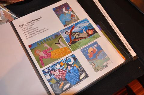
A great tear sheet used as a portfolio piece by Beth Crews Rommel...

Wonderful examples of take-aways with portfolios by Sarah Frances Hardy...

and Robyn Hood Black...

and Shanda McCloskey...

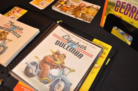
And a dummy (to the left) tucked in with the artwork...by yours truly, Elizabeth O. Dulemba.


Thank you for this. I'm assembling artwork for my first portfolio critique, and this is just in advice I needed.
ReplyDeleteCheers,
Jim Public
Glad it helped, Jim!
ReplyDeleteGreat information here! I know this is an old post, but I'm loving the portfolios (the actual binders) in the photos, and I'm having trouble finding a comparable one. Can you give me any details about the ones pictured here?
ReplyDeleteSarah, Most good art supply stores carry a variety of portfolios. Check out Binders, Dick Blick, Sam Flax, etc. Cheers!
ReplyDelete